
Customizing the Chat Widget
Personalize the chat widget to match your brand and enhance customer experience. The Deploy page is organized into three tabs: Appearance, Settings, and Deploy.
Accessing Widget Settings
- Go to Settings in the left sidebar
- Select Chat Widget
Appearance Tab
The Appearance tab controls how the widget looks to your customers.
Bot Name
Set the name displayed in the chat widget header. This appears when customers interact with automated responses or before an agent joins.
- Default: "Bot"
- Example: "Support Bot", "Amy", "Help Assistant"
Bot Avatar
Upload a custom avatar image for your bot. This appears next to automated messages and in the widget header.
- Click the avatar to upload a new image
- Hover over the avatar to see edit/delete options
- Recommended: Square image, at least 100x100 pixels
Background Pattern
Choose a background pattern for the chat home screen:
- None: Clean, minimal white background
- Patterns 1-4: Various subtle patterns
The preview on the right shows how each pattern looks in the widget.
Widget Position
Choose which corner of the screen to display the widget:
- Bottom Right (default)
- Bottom Left
- Top Right
- Top Left
Settings Tab
The Settings tab controls widget behavior and advanced options.
Greeting Message
Display a welcome message that appears automatically when customers open the widget. This helps start conversations proactively.
Example greetings:
- "Hi! How can we help you today?"
- "Welcome! Ask us anything about our products."
- "Hello! Our team typically responds within 5 minutes."
Leave blank to skip the automatic greeting.
Quick Replies
Quick Replies are clickable suggestion buttons that appear below the greeting message when a customer starts a new conversation. They help guide customers toward common topics and reduce friction in getting help.
What are Quick Replies?
Quick Replies are pre-defined response options that customers can tap instead of typing. When clicked, the text is sent as if the customer typed it themselves. This makes it faster for customers to start conversations about common topics.
Adding Quick Replies:
- In the Settings tab, find the Quick Replies section
- Click Add Quick Reply
- Enter the text (e.g., "Track my order", "Request a refund")
- Add up to 6 quick replies
- Use the X button to remove any reply
Examples of effective quick replies:
- "Track my order"
- "Request a refund"
- "Speak to sales"
- "Billing question"
- "Technical support"
- "Cancel subscription"
Pairing Quick Replies with Intent Flows:
Quick Replies become especially powerful when paired with Intent Flows. When a customer clicks a quick reply, the message can trigger a matching Intent Flow that guides them through a structured conversation.
For example:
- Set up a quick reply: "Request a refund"
- Create an Intent Flow with trigger phrases like "refund", "get my money back", "return"
- When the customer clicks "Request a refund", the Intent Flow automatically:
- Asks for their order number
- Collects the reason for the refund
- Tags the conversation appropriately
- Escalates to a human agent with all details collected
This combination lets you provide instant, guided assistance for common requests while gathering the information your team needs.
Using Quick Replies Independently:
Quick Replies also work well on their own without Intent Flows. In this case:
- The customer's message goes directly to your team or AI assistant
- They serve as conversation starters and topic suggestions
- They reduce typing friction, especially on mobile devices
Tips for Quick Replies:
- Keep text short and action-oriented (under 30 characters works best)
- Use language your customers would naturally use
- Prioritize your most common support topics
- Test different options to see what customers click most
Home Cards (Standard+ Plans)
Add custom link cards that appear prominently on the widget home screen. Use these to direct customers to important resources:
- Status pages (e.g., Instatus, Statuspage)
- Booking links (e.g., Calendly)
- Documentation sites
- Social media profiles
- Contact pages
To add a home card:
- Click Add Card
- Enter a title (e.g., "System Status")
- Enter the URL
- Optionally add a description
- Select an icon from the picker (search or browse by category)
You can add up to 5 cards. Use the arrow buttons to reorder them.
Hide on URLs
Hide the widget on specific pages of your website:
- Use exact paths:
/checkout,/login - Use wildcards:
/admin/*(hides on all admin pages)
Click Add URL pattern to add more rules.
Deploy Tab
The Deploy tab contains your embed code and sharing options.
Embed Code
Copy the embed code and paste it into your website's HTML, just before the closing </body> tag. The widget will appear on all pages where the code is installed.
Send to Developer
Click the email icon next to the copy button to send the embed code with installation instructions directly to your developer. Enter their email address and we'll send them everything they need.
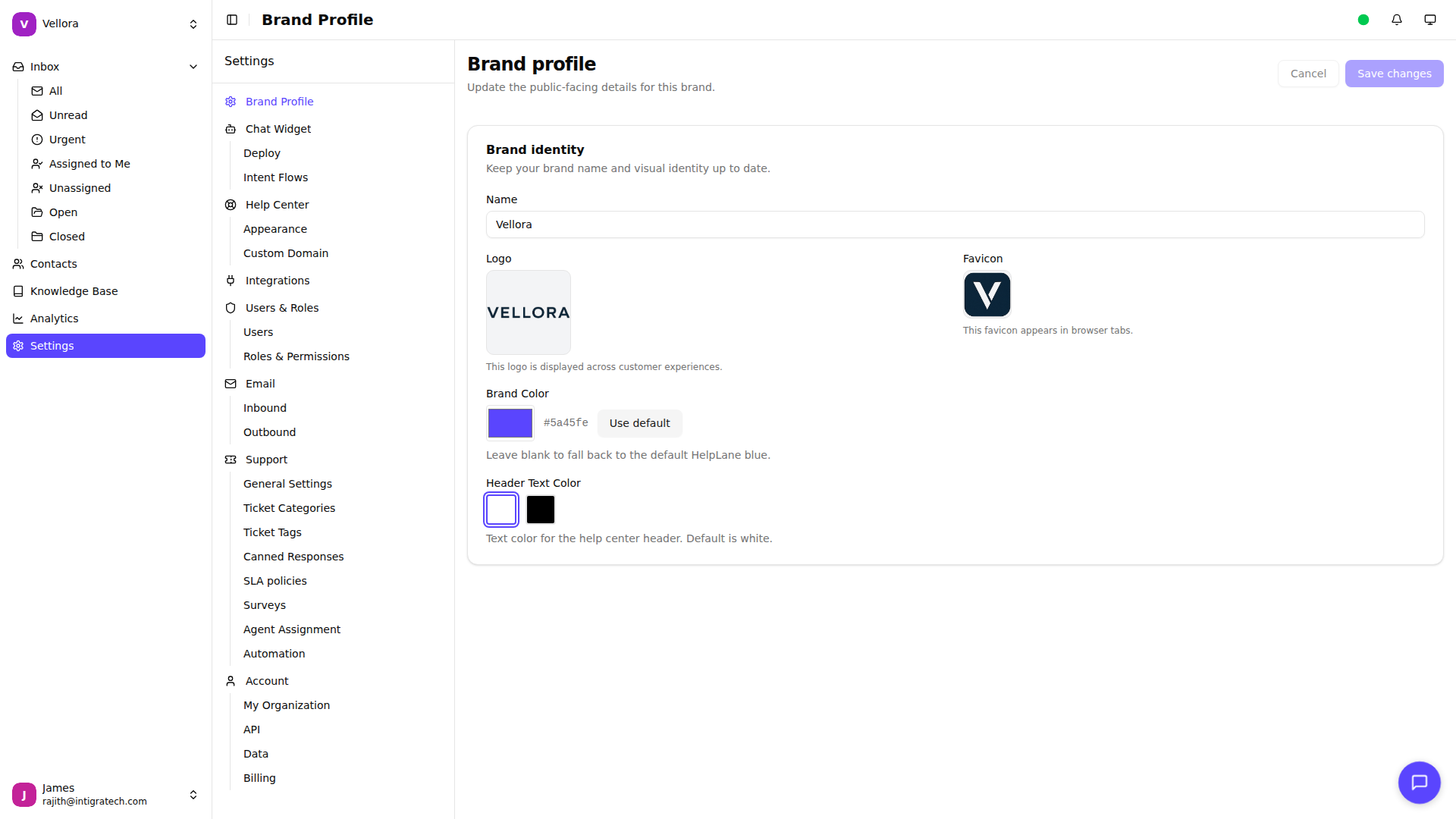
Brand Colors
The widget uses your brand color for headers and accents. To change this:
- Go to Settings > Brand Profile
- Update your brand color
- The widget automatically uses this color
Live Preview
As you make changes, the preview panel on the right shows how the widget will appear to customers. Use this to test different combinations before saving.
User Identification
Pass customer information to personalize their experience. Add these optional parameters to your embed code:
window.HelpLaneSettings = {
  brandToken: "your-token",  // Identify logged-in users
  name: "John Doe",
  email: "[email protected]",
  phone: "+1234567890",
  userID: "12345",  // For SLA policy matching
  tier: "enterprise",  // Custom data
  meta: {
    company: "Acme Inc",
    plan: "pro"
  }
};
Parameters:
| Parameter | Description |
|---|---|
name | Customer's display name |
email | Customer's email address |
phone | Customer's phone number |
userID | Your unique identifier for this customer |
tier | Customer tier for SLA matching (e.g., "free", "pro", "enterprise") |
meta | Object for any additional custom data |
Runtime Overrides
Developers can override certain widget settings at runtime using the overrides parameter. This is useful for page-specific configurations without changing the dashboard settings.
window.HelpLaneSettings = {
  brandToken: "your-token",
  overrides: {
    position: "bottom-left",      // Override widget position
    hideOnMobile: true,           // Hide widget on mobile devices
    mobileBreakpoint: 768         // Screen width threshold (in pixels)
  }
};
Available overrides:
| Override | Type | Description |
|---|---|---|
position | string | Widget position: "bottom-right", "bottom-left", "top-right", "top-left" |
hideOnMobile | boolean | Set to true to hide the widget on mobile devices |
mobileBreakpoint | number | Screen width in pixels below which the device is considered mobile (default: 768) |
Benefits of User Identification
When you identify users:
- Persistent History: Customers see their previous conversations
- Agent Context: Agents see customer details in the sidebar
- SLA Policies: Tier-based SLA policies are applied automatically
- Contact Merging: Conversations across sessions are linked
- Integration Data: Connected apps can show relevant customer data
Testing Changes
- Make your customizations
- Click Save changes
- Open your website with the widget installed
- Verify the changes appear correctly
Hard refresh your browser (Ctrl+F5 or Cmd+Shift+R) if changes don't appear immediately.